Uber Eats Rebranding
As Uber Eats grew from a small experiment with a fixed menu to delivering food around the world, they needed a new brand, something that would reflect the business of food delivery.
The Brand Team and I were tasked with owning the rebrand. We worked with our strategy team to conduct user research and had close collaboration with the Eats team from start to finish.
Company » Role » Year
Uber » Brand Designer II » 2016-2017


Strategy + Brand Architecture
As a designer on the core brand team, our client was the Eats team. A major component was aligning on how the Eats brand would be represented, not only for Eats, but also any additional sub-brands. Would it be a wordmark, logo, both? With the existing typeface and guidelines, Eats didn’t receive enough emphasis to hold up to competitors.
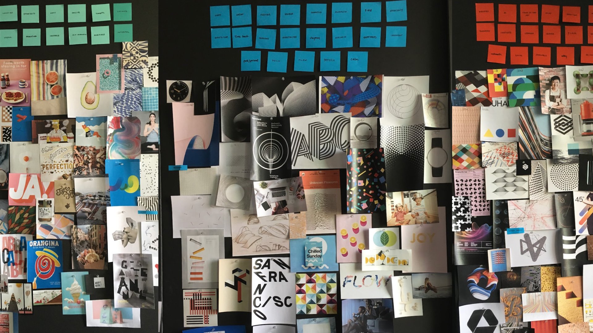
3 Strategic Design Concepts
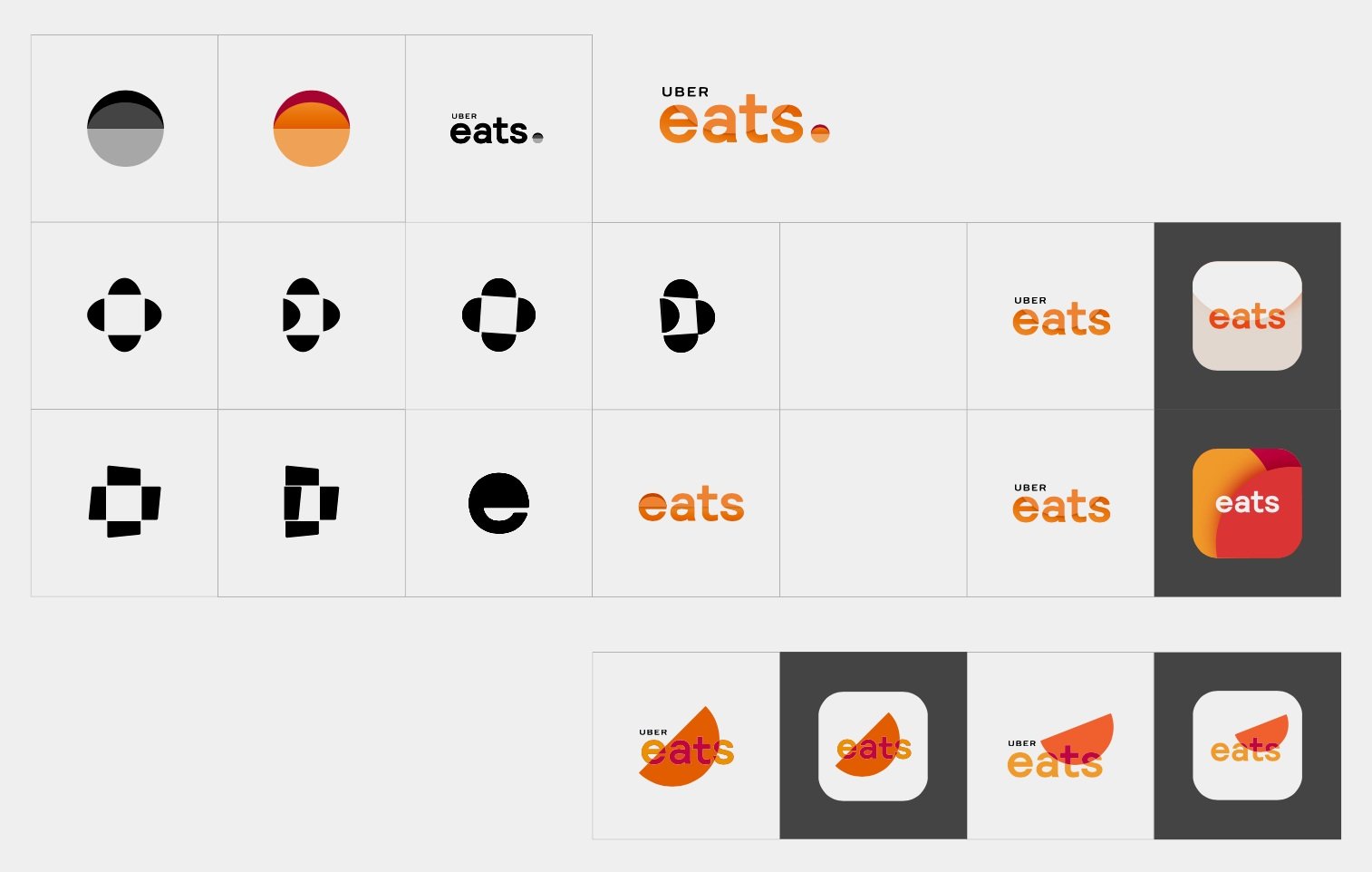
We explored three concepts, introducing new brand elements and a new logo. The initial goal was to keep the mark within the same framework as the master brand mark.
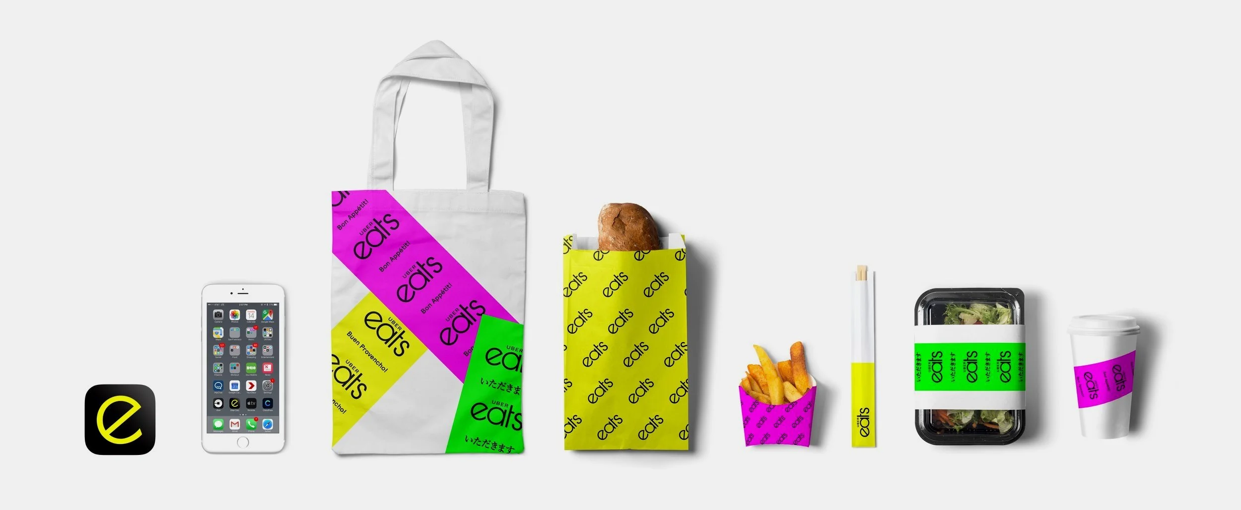
I owned this concept which was focused on how Uber Eats can save you time. Rather than spending time in the kitchen, or running around for food, spend it with those you love.
Branding Exploration
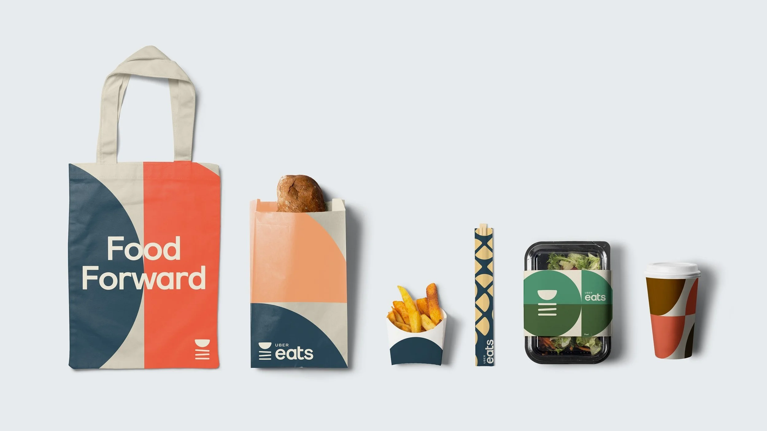
The New Uber Eats
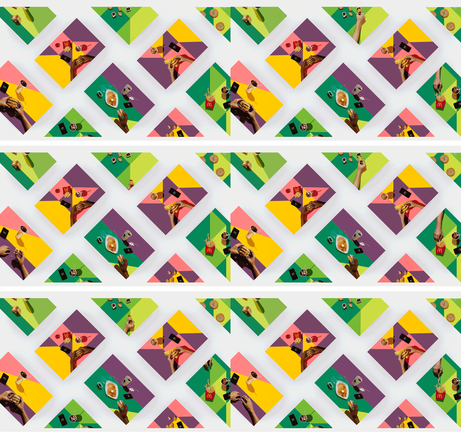
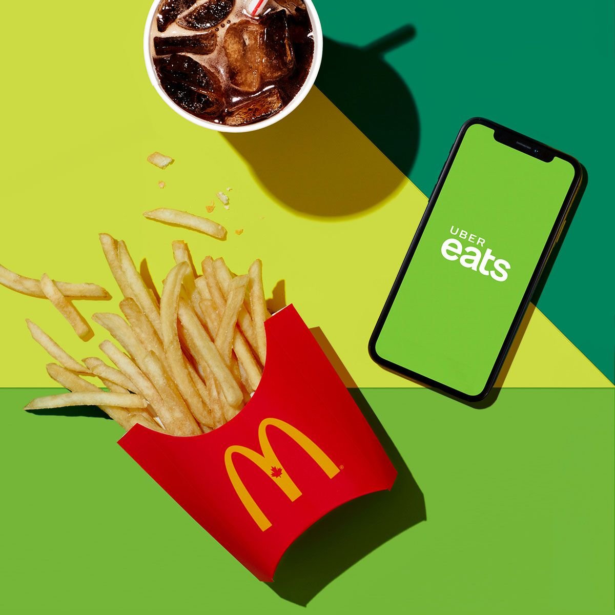
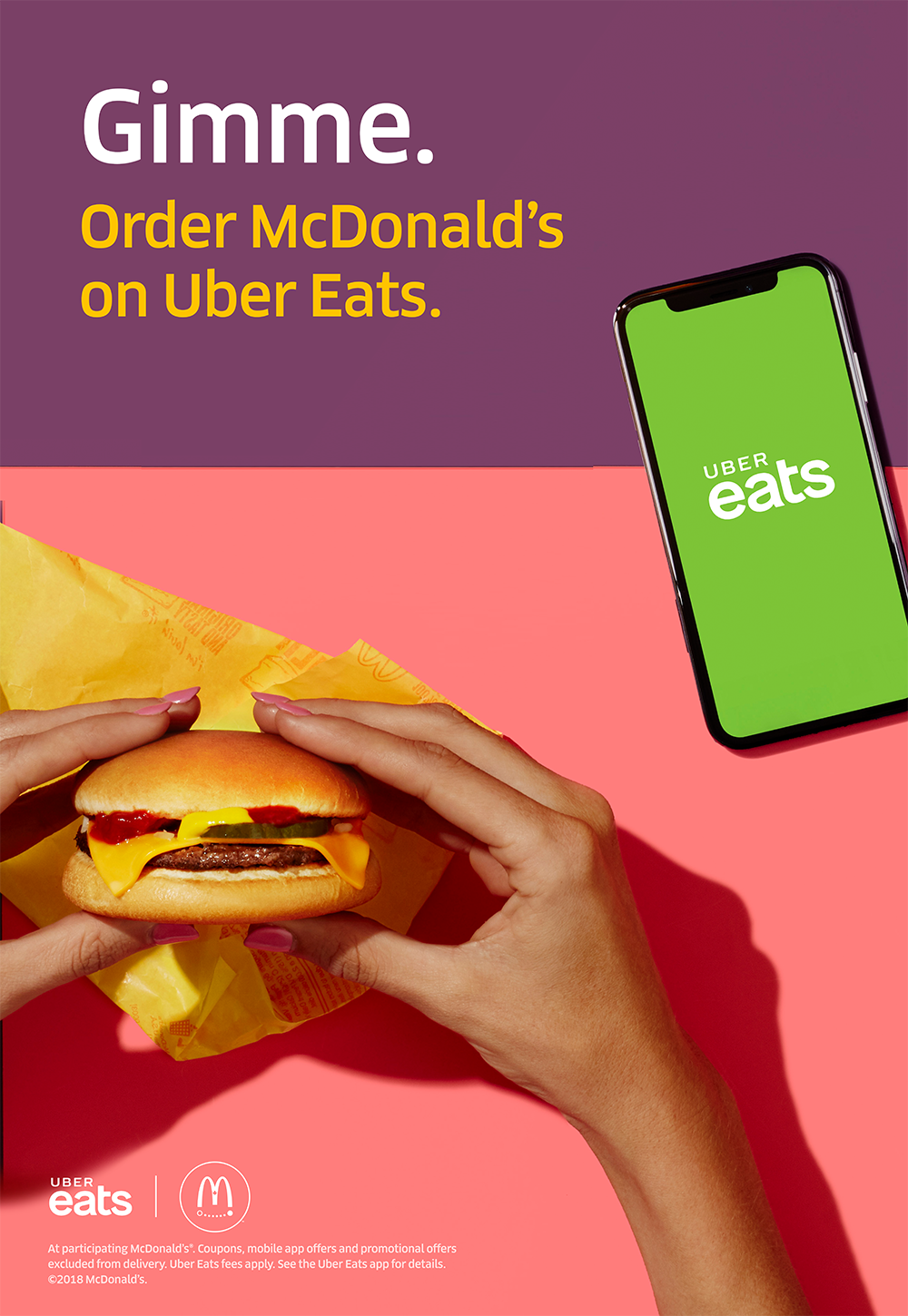
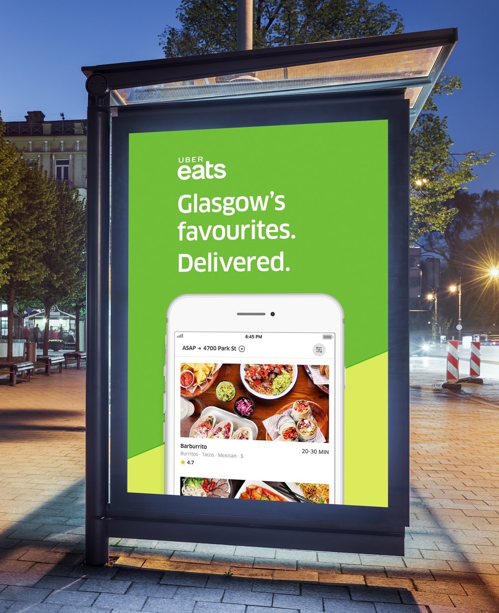
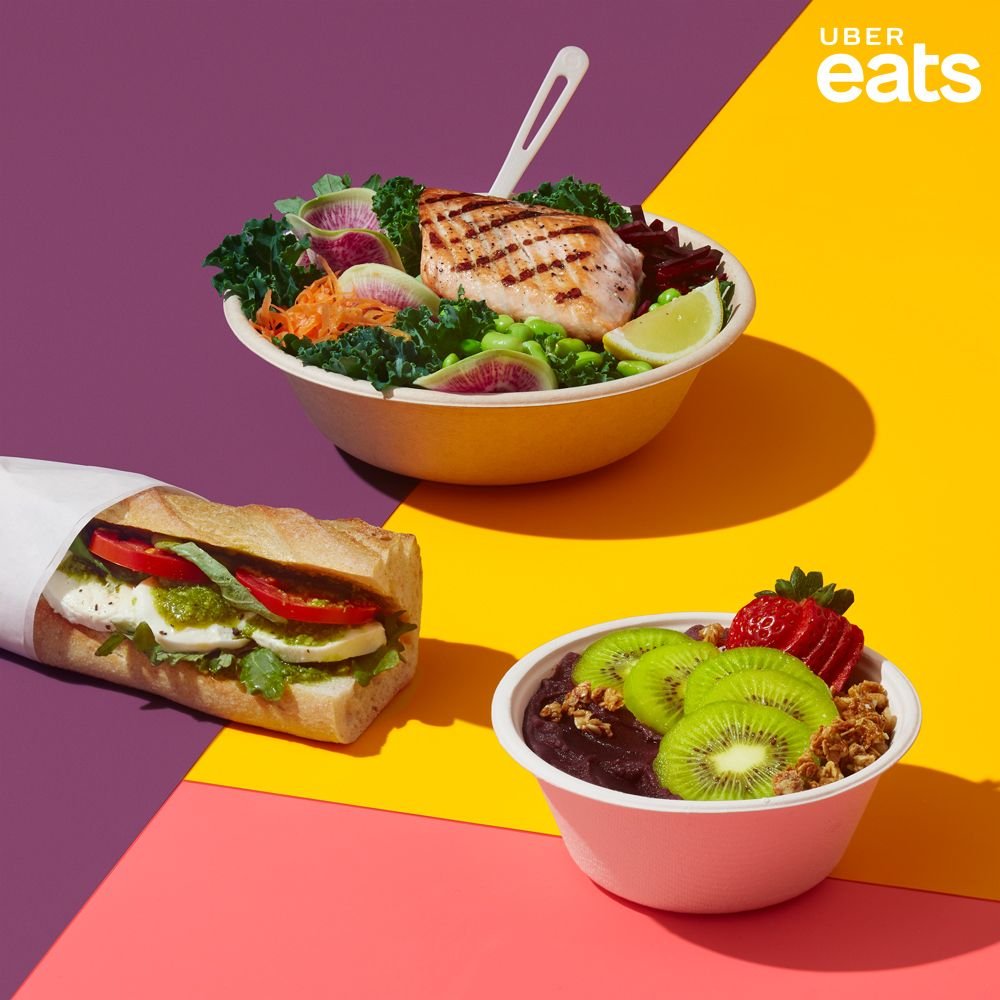
After much exploration, Eats would remain a sub-brand, endorsed by the master brand. The branding took on a new language of its own, with a custom wordmark, new visual elements, illustrations, and a vibrant color palette.
